

This map… Well, the only thing that could only be derived from looking at this map is the information in its legend and how it can be applied by looking at some continent somewhere on earth. This map lacks all the basic map elements other than the legend: No title, author, publisher, scale, date, source, map projection, and the inset information. Perhaps this map was not meant to be a stand-alone one; even so, that is still not an adequate (actually, there should be none accepted) excuse to not included the essential map elements.
Based on the only map element present, this is some sort of a choropleth map. I’m unsure of its theme for the delineation of its said ‘per sq. mile’ division of the land area included is unclear; in other words, though the color choice are wisely chosen for their contrasting factor, the application of the signs and symbols in the map legend is very hard to understand.
On the other hand, the general map lay-out is very decent. The placing of the map objects present are clearly on the visual center, making its appearance a balanced one.
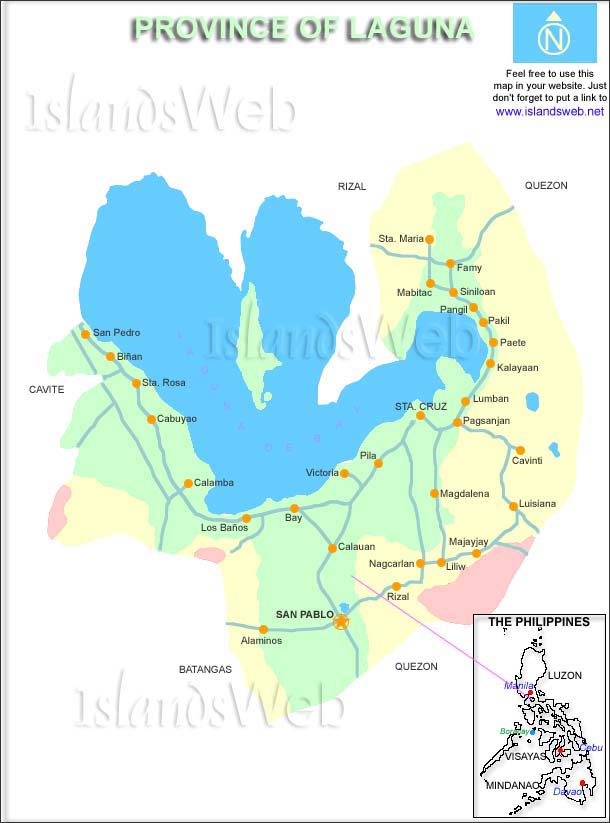
The province of Laguna... is an island? Needless to say, the watermarks on this map lay-out distracts the focus (unless the IslandsWeb marks are the intended focus of this image); it’s on the top, center, and bottom part of the map – implying that it is something the author is suggesting to be important. Anyway, even though my attention was disrupted by the obvious promotion of the owner’s name, the visual center is perfectly occupied by the ideally intended main information carrier – the map.
The map has a title, an inset, and.. has no scale, source, date, publisher, author, projection, north arrow, and legend. Obviously, it’s designed to be a general reference map; it contains roads, location points of places, and clear difference between what is supposed to be the political territory and the water body inside the province. An individual that is familiar with the place depicted could easily interpret the map, but the fundamental aim of maps in general is to deliver information as smooth as possible, which this map almost, but not quite, attained.
Regarding the lay-out, I think it could be improved, in addition to providing the aforementioned deficiency, by changing the orientation to landscape because of the shape of the mapped province; in this way, the visual balance could be seen better and the space could be easily distributed to the map elements.

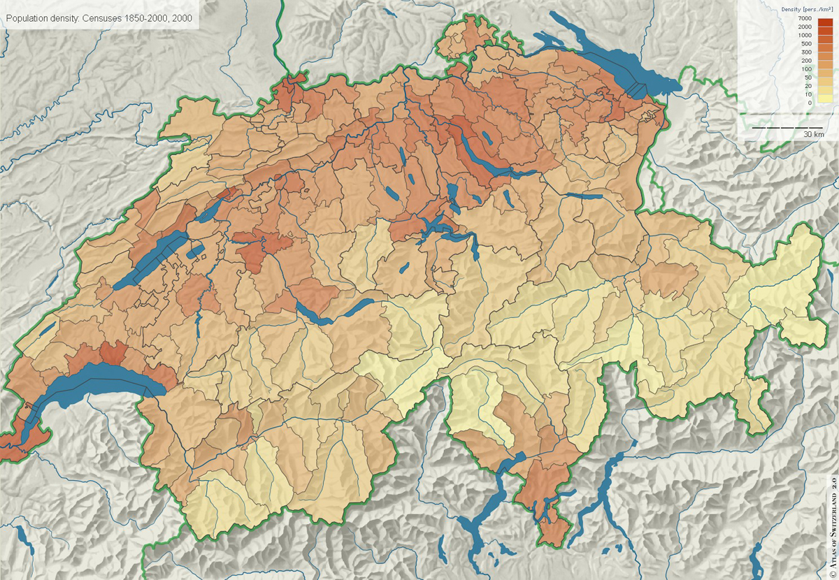
Despite being a, but not necessarily essential, part of studying geography, I’m not familiar with names of places. Actually, memorization in general is not my thing. So, if it weren’t for the subtle hint given by this map’s inset, I wouldn’t have any idea where this place called ‘Ontario’ is.
Even though this map has no title and projection, this actually is a good example of a general reference map, mainly because of its immediate appearance of visual balance - with respect of its color, visual center, decent placing of labels partnered with their translation, and a good arrangement of its existing map elements – of which all contributes to the effectiveness of delivering information. There are only two problems in it, in my opinion: the slight error in choosing the arrow and place designated for the maps north arrow and the intentional concentration of all the elements in the center, thus leaving spaces above and below them.

No scale and projection – unnecessary map elements to this kind of map. This is a choropleth map – it shows differences of places with respect to a specific topic; in this case, the topic of the map is indicated in its title. The title is… not obviously treated like one for it is erroneously placed above the map legend. The map title should always be stated clearly and should grab adequately attention; this map failed to do that. Also, the title is too long. I think that the year should have been indicated separately.
The overall visual balance of the map lay-out is poor. In my opinion, this could have been caused by the incorrect placing of the title, map legend, and the logo of the author/publisher. The color choice is also bad; the background color captures some attention that it shouldn’t.
Another thing that bothered me is the value placed inside each color box in the map legend. With further thinking, I concluded that the author may have intended it to be an example of how he/she placed additional information in the form of value. The placing of value on every delineated place is also faulty, especially in Russia.

At last, an example of an excellent map. Map elements present in this one include: title, author, publisher/organizer, and the date and source of data. Map elements not included: scale, north arrow, and projection – all of which are unnecessary due to the type and objective of the map.
This is a thematic map, I’m not sure what type it is specifically though. I doubt that the author or maker of this map is necessarily a cartographer for I am quite certain that this can never be done on any map making software currently invented – that is, anyone with adequate graphic knowledge can produce an output such as this.
The objective/topic of the map is clearly stated in its title. The position of the title down to the position of the elements on the lower part of the map conforms to the flow of visual reading. The color choice is excellent. The hierarchy of importance among the information portrayed is emphasized through the font size. The overall visual balance of the map can be seen at one glance. The only thing it lacks, for me, is the suggestion that the map was intended to be a world map; I think this should be included for the pursuit of representing each continent/country with the smart positioning of number ratios created a high level of deformation, even if it nearly succeeded.

As indicated in its map title, this is a political map. Aside from the title, it also has a map scale, and a map legend. Though at first glance it seems to be a good map, it isn’t. This first impression could be attributed to the maps decent lay-out; it has a decent color choice, visual center occupied by the most essential part, good font/s, and adequate placing of the elements.
In spite of the good qualities aforesaid, it should always be kept in mind that essential map elements should only be removed only if they are unnecessary in obtaining the objective of the map. Clear statement of the perspective is always done when dealing with political matters. In this case, the north arrow, date and source of data, author and publisher, date of publication, scale, and projection – in short, all the elements – should be included.

At first, I thought this was a map from some video game available out there; I only knew that it was actually a map of an existing place on earth when I took a look over the url of the image; in short, I’m unfamiliar with this mapped place. This ineffectiveness could be attributed to the lack of title of this map. Even if the intended audiences of this map are those familiar with the place, it should always be take into account other possibilities, e.g. other people coming across with this map. Other elements that this map lack are: author, publisher, map scale, date and source of data, date of publication, map projection, and the type of this map. Despite this, the only elements present in this map are properly position, especially the choice of orientation with respect to the shape of the map.
This map is obviously a choropleth map. What’s unclear to me though is the crumpled-like appearance of the map. Well, it’s clearly to show the elevation differences of the surface, but was not indicated, nor is the supposed to be water presence represented by the color blue parts of the map, both of which should have been indicated in the legend.
The map title is inadequate for it does not mention which place/country it is specifically concerned. The name of the author/publisher is unusually positioned vertically, making it ineffectively hard to read. The objective of the mop topic was tainted with the inclusion of elevation and drainage information.

Based on the number of occurrence of the word viatnamese in this map, I’m guessing that the country mapped here is Vietnam. Though this map has a semi-title above the legend, it does not contain the necessary information to tell the reader exactly what is shown. Other deficiency of this map is its scale, author and publisher, date and source of data, date of publication, and the north arrow.
Color is always evident. So, I don’t understand the author’s choice of color. He/she obviously chose orange as his main color, thus making the color green off a little bit off of this map color choices. Regardless of this, the distinctions between colors are clear making the map still conforming to its function. Another thing that I noticed is the varying orientation of some of the map’s labels: some are positioned diagonally, some horizontally, and others are even almost vertically positioned.

Oh, it’s the Philippines! But is it really so? Even though it is obviously the Philippines, other audience/s could not be as familiar as me to the looks of my own country. Like I’ve mentioned before, even if things are obvious one should never assume anything, unless it is certainly of general knowledge to mankind.
This map is only has a title, and a legend. It lacks scale, author and publisher, date and source of data, date of publication, projection used, and the north arrow. Though functional, the color choices in this map made it dull. Despite of the color, the over-all appearance of it is visually balanced.
No comments:
Post a Comment